


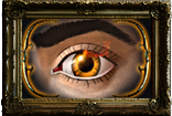
The new gem art just looks messy
|
The new gem icons look horrible. I appreciate the effort GGG have put in, but ughh they're so horrible to look at :S
OP's design is more along the lines of what I thought they would look like. Also, I agree with them looking more like jewellery than gems. |
|
|
I like the new gems arts ... they look badass right now :D.
IMO we're just not yet used to it. Last edited by grasmann#3903 on Feb 13, 2013, 8:59:53 AM
|
|
|
OK. Glad I am not the only one. The new designs are confusing. Inventory blindness was kinda rough to begin with and now gems totally blend in.
Overall I'd say the inventory icons need to be more icony and less arty... but even more so for gems / orbs etc. |
|
" I had the same thought, i.e. would have preferred engraved symbols maybe with a gold or silver inlay. It would do the same job but without giving the gem tab the look of a candy store or a mad jeweller's display. In its current state, gem art is way too gaudy for me. Exit, pursued by a Plummeting Ursa.
Finding Names for your Characters Loot Filter Colour Palettes Namen für Eure Charaktere Informationen zur Benutzung des Forums |
|
|
Definitly the example OP have made is clearly more to the point, most importantly more true. In graphic design no one should care how paintings to be looking cooler than another; simplicity is wanted. And even within this very quick mock-up you can see it is there.
Simple, clear, subtle and not saturated/eye candy. Thanks to OP for spending your time so hopefully this could be an attention for devs. I can no longer call current art as 'gems', but jewelery indeed. "This is too good for you, very powerful ! You want - You take" Last edited by BrecMadak#3812 on Feb 13, 2013, 9:31:16 AM
|
|
" Yes, I agree. The new gem icons look nice, but add confusion at the same time. They're too "pimped up" and "graphic". OP's icon-set is better. When night falls
She cloaks the world In impenetrable darkness |
|
|
Leave the new gems alone. They're awesome and super easy to distinguish at a glance. What more do you want? Messy my ass.
Last edited by teacherpeter#1699 on Feb 13, 2013, 9:52:29 AM
|
|
|
I personally don't have any problems with the new gems. Will take a little getting used to, but so far I've been able to find gems in my inventory much easier than before and getting to the point where I can tell at a glance what each one is instead of having to mouse over them one at a time.
|
|
|
I don't like to complain, but I have to say I agree with OP.
Looking at the gems in isolation, they can look nice. But when I look at my full page of gems, it's just too much -- too many shapes and colours. I would prefer the inlaid icon look that OP suggested. Needs to stay clean and simple. And I'm imagining that in a year's time, when GGG has implemented a lot of new skills, this kind of gem art will get more and more confusing. Hideout of the Week S01E04 thread: http://www.pathofexile.com/forum/view-thread/1088847
|
|
|
Plus, the new gems just look badass as hell. Get over your expectations, guys, and just enjoy the fact that the new gem art is gorgeous, premium quality stuff. I was expecting what you wanted too, but when I saw what was in the inventory waiting for me, my jaw dropped. So much detail, such excellent design.
My opinion: You're not used to it. If we had this style of gem from Day 1, no one would say a thing. |
|


