
Today we want to share some concept art from the Oblivion and Merchant microtransaction themes with you. If you're interested in getting a glimpse into our microtransaction development process or you've liked our recent cosmetic effect themes, be sure to check them out below!
Oblivion Armour Pack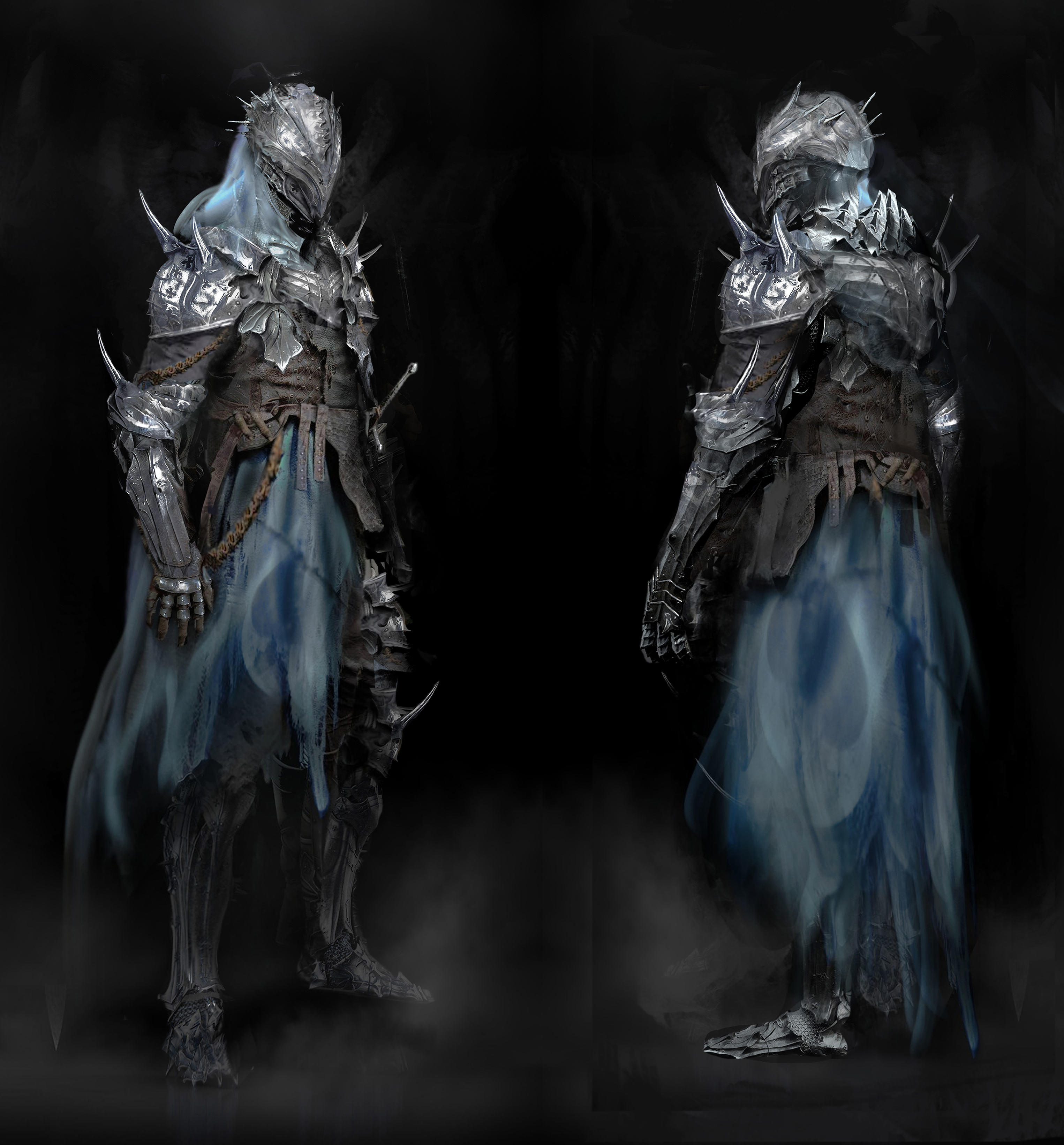
Oblivion Wings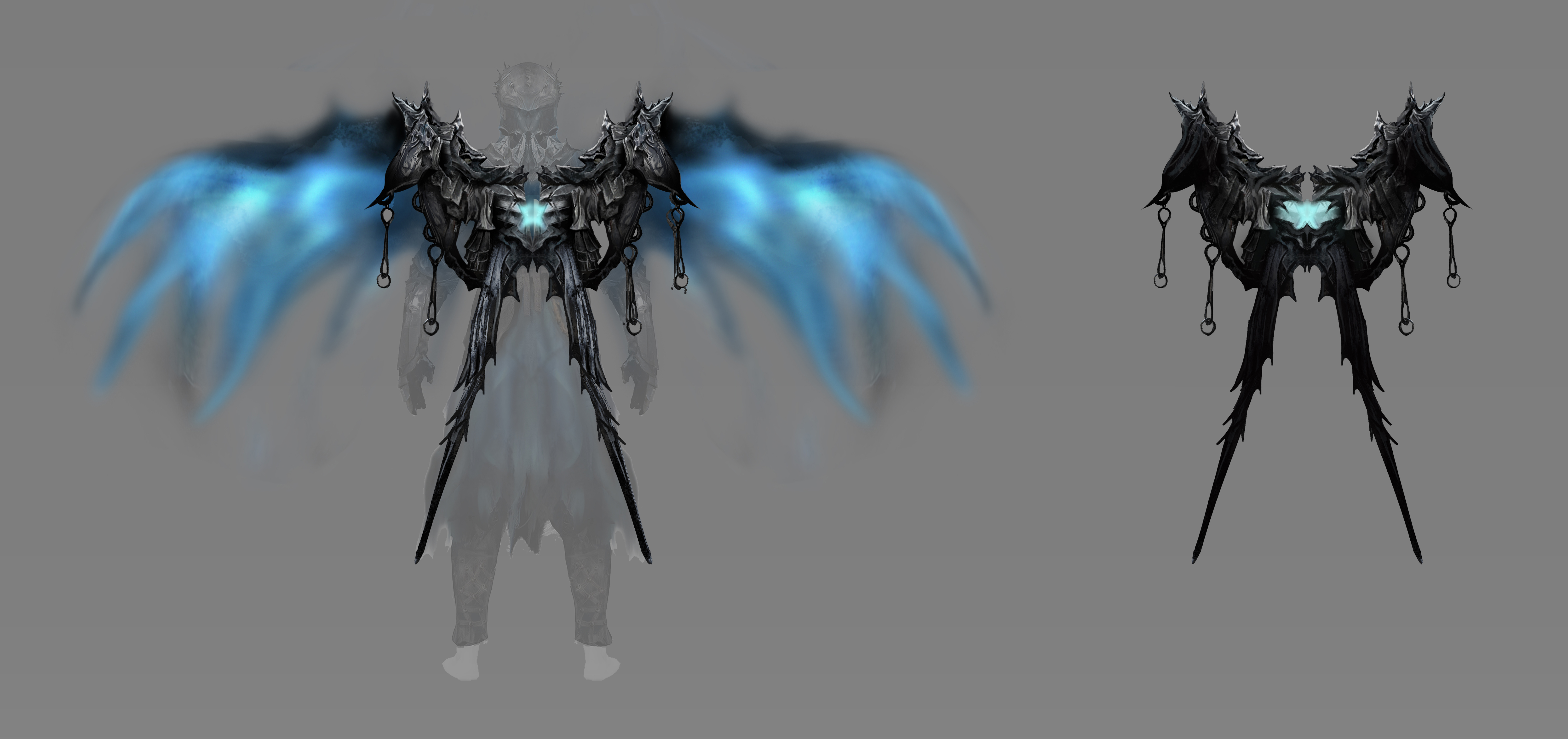
Merchant Armour Pack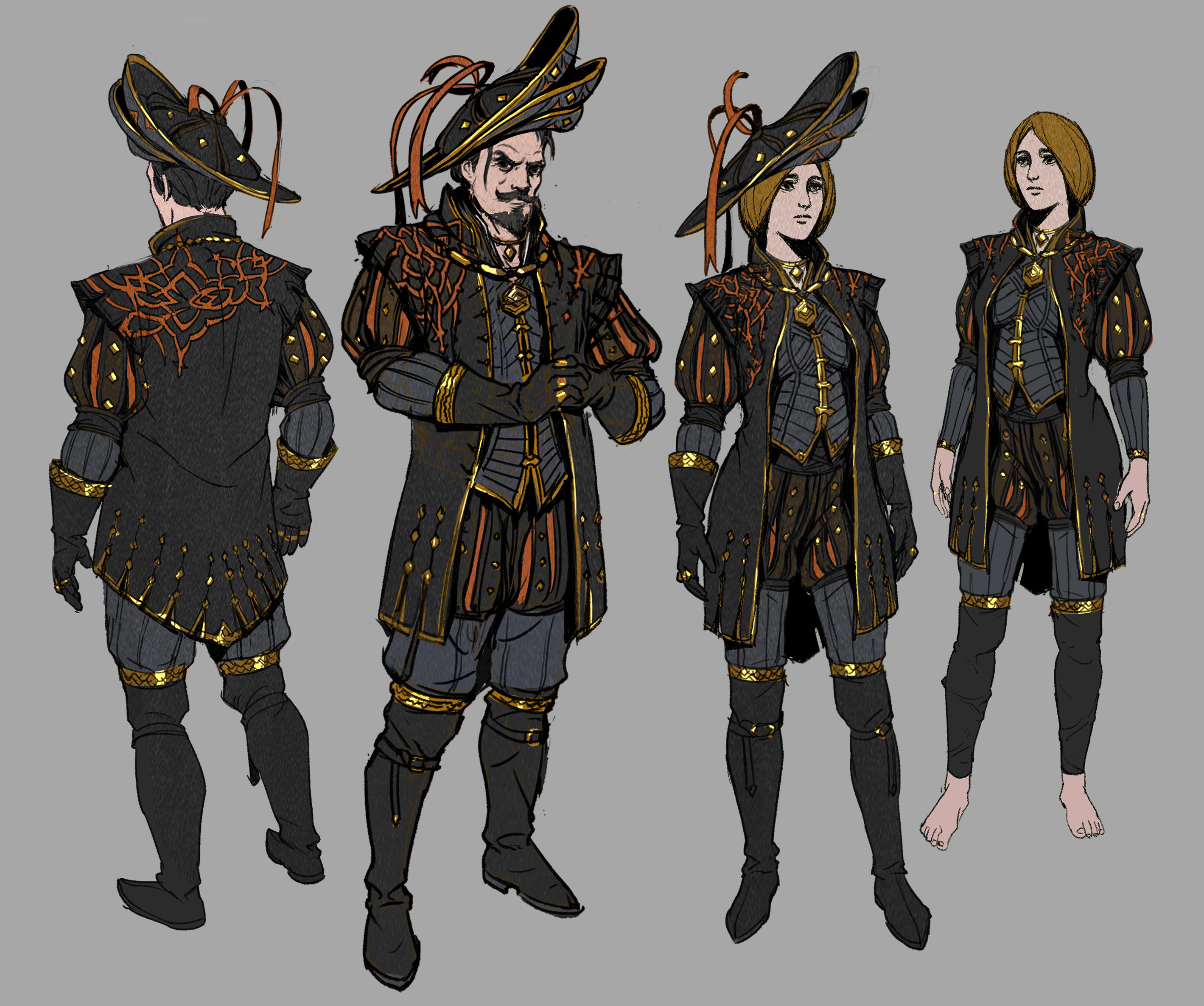
Merchant Cloak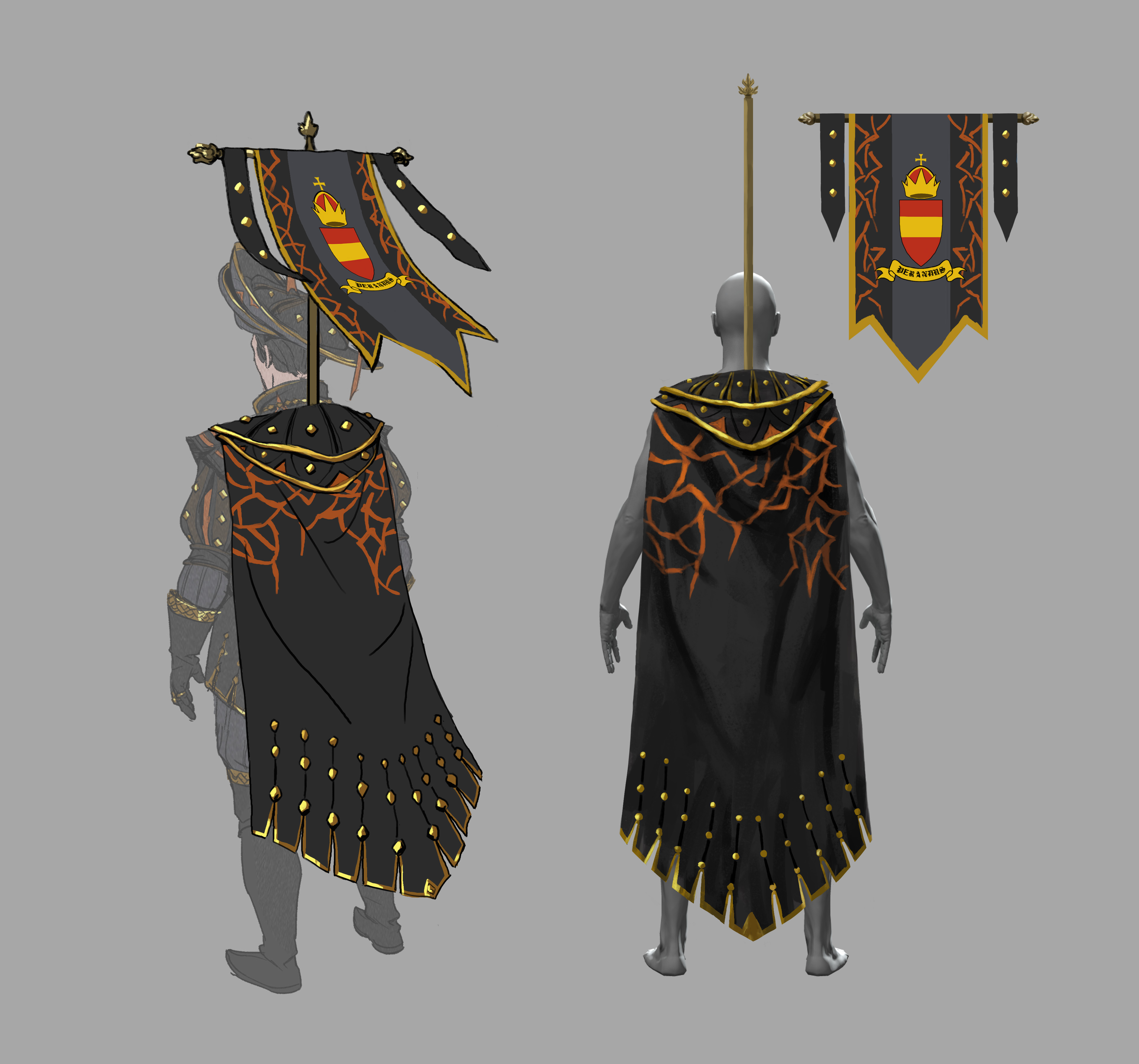
Merchant Weapon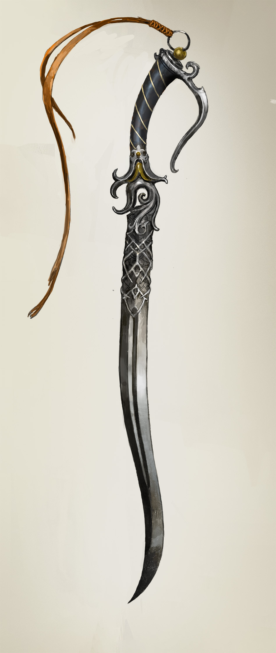
Merchant Aura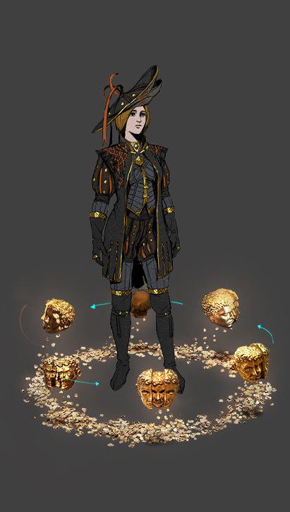
|
|
|
Oblivion Armor Pack is VERY inspired by Artorias from Dark Souls :D
|
|
|
Oblivion Armor looks sweet...best Ive seen in a while
I've lost control of the controls...
Jesus take the wheel" RAizQT during Kammel HC race |
|
|
I'm sorry, but it looks TERRIBLE.
 [Removed by Support]
|
|
|
Cool
|
|
|
Yeah, it would be a lot nicer if they got rid of the blue crap.
"Gratitude is wine for the soul. Go on. Get drunk." Rumi
US Mountain Time Zone |
|
|
Somewhere along the line, the Merchant Hat got a 150% size buff from the concept art. Sometimes I like the ridiculousness of it, and sometimes I don't. Makes a refreshing change of pace sometimes.
"People ask me why I do this at my age. People are rude."
|
|
|
The concept art looks fantastic. The in-game translation not so much. The Oblivion sets Artorias Dark Souls vibe could have made it one of the best armors in the game. But in my opinion it's just another over priced MTX that misses the mark. Maybe I could afford to be less critical if it wasn't the cost of an entire AAA game. But as is the value of having an awkward blue glowing skirt with strange physics flopping about and standing out like a sore thumb doesn't really seem worth 45 dollars to me.
|
|
|
I really like the armour and the wings but the blue thing on the armour dont look as good as i thought in game. Would buy it if it gets fixed in the future. The concept art is amazing tho
Last edited by ttuuff#4138 on Jun 21, 2021, 9:51:02 PM
|
|
" Yup... :/ |
|


