


Feedback on Colourblind Support for Gem Sockets
|
And does all color blind players know "layout of the passive skill tree" or what those notches means? I dont think this is working solution to anything related to colorblindness
Edit: And that blue notch, really? :D Last edited by Nadragh#2753 on Sep 1, 2021, 12:32:39 AM
|
|
|
The green is too yellow & dull. The red is just too dull. THAT is the biggest issue with getting red/green mixed up.
|
|
|
dudeeee...wth is this. just add colourblind mod for those who colourblind. why u guys making a simple thing in a hard way. use some brainsssss
|
|
|
What about making simple shaped symbols around the sockets?
EG: Triangle ~ Square ~ Oval (~ Diamond for whites?) If done right, I believe it could be a huge visual aid & leaves little room for mistakes. Kudo's for the efforts eitherway. I hope you can get this worked out. :) |
|
|
I'm colorblind (deuteranopia) but these notches are waaay too subtle - was hoping we would be able to distinguish sockets more easily & quickly.
Emphasis on the quickly. By far the biggest issue for us is that it can take a lot of time to figure out which sockets are green and red thus making the process of chroming an item take 10-20x times longer than what it should have taken. Having these microscopic notches helps (it's better than nothing) but they are so subtle and tiny that it won't solve the main issue - being able to identify colors quickly. My suggestion: - make red and green colors more pronounced (they are both so incredibly washed out) - make notches about 5x thicker if you want to keep them - make a solution that's extremely pronounced so instead of notches maybe change socket shapes to square, circle, triangle (and just make it an optional feature so it doesn't bother regular players) You are trying to solve this issue by making an universal solution so you are forced to be subtle about it. But that doesn't help us much. Just go wild and make it an optional feature. In many other games we have optional accessibility features so there's nothing wrong with that approach and we are used to it already. |
|
|
I don't have a problem with sockets when it comes to my level of being color blind. Maybe it is that my monitor is well calibrated.
But when it comes to Oils and the advanced tooltip on passive tree, just add there "text" with oil names, don't try to be graphically clever, please :D I represent only myself, my own thought and believes. I am individual, not a representative of the community.
I am not speaking on behalf of someone else and I don't get offended by things that have nothing to do with me. 3.13 was the golden age. |
|
|
I'm quite colorblind. The green socket one blends in too much. A tiny line like that doesn't really help anyway, it would cause too much eyestrain to identify on the fly. I'd recommend something like socket shapes, or the a larger identifying mark on the outside, or if the whole trim of the socket were unique to each. Perfect circle for white, wavy for blue, spike like needles protruding for green, and jagged for red. Something like that.
|
|
|
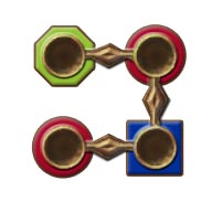
I would change the base shape to be honest. For example:
 |
|
 |
|
|
Maybe this is more effort edit but some games with using primary colors just have them in as Different colors, like Grim Dawn or more recently noticed on Mini Motorways.
Even more effort would be adding keybind on which press it shows Big Letter over the Socket , or just while u are pressing the button to compare stats |
|


